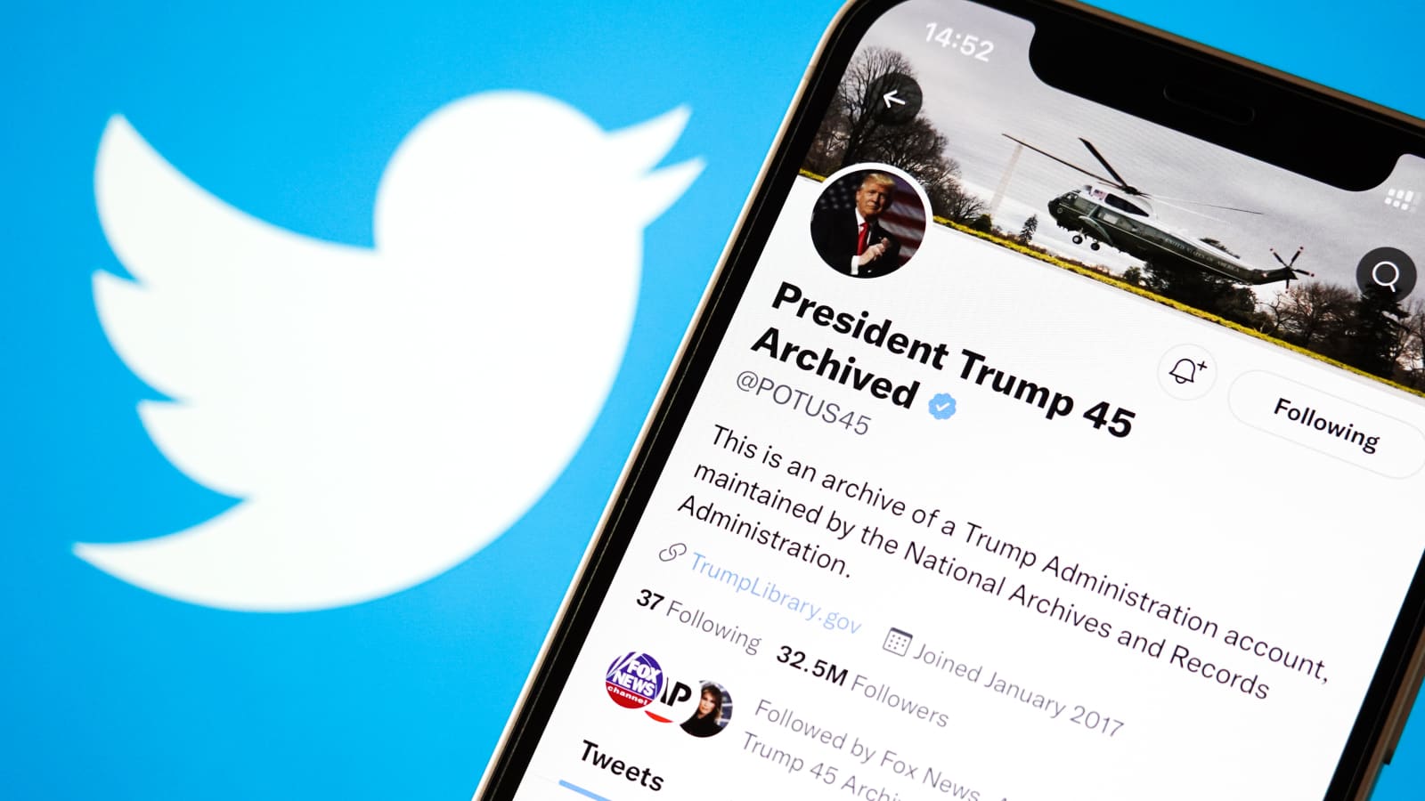
When it comes to platforms that have revolutionized the way we communicate online, Twitter is undeniably at the forefront. With its bite-sized pieces of content, it has become an essential tool for news dissemination, celebrity interactions, brand promotions, and daily rants. But, as with any digital interface, the design and aesthetics play a significant role in the user experience. A significant part of that experience? Typography.
You might have asked yourself at one point or another: What font does Twitter use? It's a valid question. Fonts can evoke emotions, guide readability, and become an intrinsic part of a brand's identity. This post dives deep into Twitter's typography choices, specifically focusing on the burning question: What font does Twitter use for tweets?
Twitter's Typography Evolution
Before we get to the specific font Twitter employs today, it's worth noting that Twitter's font choices have evolved over the years, just like the platform itself. From its inception in 2006 until today, Twitter has made several changes to its typography to improve readability, usability, and to ensure brand coherence.
Twitter's Primary Font: Gotham
One of the most significant and recognizable typeface changes came when Twitter adopted the Gotham font. Gotham is a versatile, geometric sans-serif typeface that was designed by Tobias Frere-Jones in 2000. The font has a modern aesthetic while being incredibly legible, making it a preferred choice for many corporate brands.
When Twitter chose Gotham, it wasn't just selecting a trendy font. It was picking a typeface that resonated with its clean, straightforward, and user-focused design ethos. The font has a neutral character, which ensures that the content (your tweets!) is the main focus, rather than the font itself.
What Font Does Twitter Use for Tweets?
While the overarching brand identity used Gotham, the platform has seen subtle changes over the years when it comes to the actual font employed for tweets. As of my last update in January 2022, Twitter utilized a custom version of Chirp for its tweets.
Chirp is Twitter's first proprietary typeface. It was introduced to strike a balance between messy and sharp, functional, and expressive, all while ensuring the tweets remained at the heart of the experience. This was an amalgamation of American Gothic and European Grotesque styles, giving it a unique feel. If you've tweeted recently, then you've interacted with this font. Chirp was designed to improve legibility, especially for complex scripts. It was a conscious effort by Twitter to ensure its platform is inclusive for its global audience.
Other Typography Choices on Twitter
While Gotham and Chirp remain at the forefront of Twitter's typography choices, the platform has also utilized other fonts for various purposes. For example, for non-Latin scripts, Twitter has worked with type designers to ensure each script's distinct needs are met. These bespoke typefaces ensure that every user, regardless of their language, enjoys a seamless Twitter experience.
The Importance of Typography in Digital Platforms
You might wonder, why so much fuss about a font? But in the digital age, where users have fleeting attention spans, typography can make or break a user's experience. A good font ensures that content is readable, engaging, and accessible. It can subtly influence how users perceive the content. For brands like Twitter, the chosen font becomes part of their identity – something users worldwide recognize and resonate with.
In essence, when you ask, What font does Twitter use? you're inquiring about more than just a typeface. You're delving into the platform's design philosophy, its brand identity, and its commitment to user experience.
Conclusion
From Gotham's clean aesthetics to the expressive nature of Chirp for tweets, Twitter's typography choices tell a story of evolution, brand coherence, and an unwavering commitment to its users. The next time you send out a tweet or scroll through your timeline, take a moment to appreciate the typography. After all, in the world of design, it's often the subtle details that make the most significant impact.